How to Choose Interior Door Paint Colors That Look Expensive
Interior doors are often ignored during home decorating, but the wrong color can make even a beautiful home feel cheap, flat, or outdated. Standard white builder-grade doors often blend into walls and fail to add personality or architectural depth. In 2026, designers are using richer neutrals, warm earth tones, moody colors, and soft natural shades to make homes feel more luxurious and custom-designed. The right interior door color can instantly improve contrast, warmth, sophistication, and visual flow throughout the home.
Interior Door Paint Colors That Make Homes Look Expensive
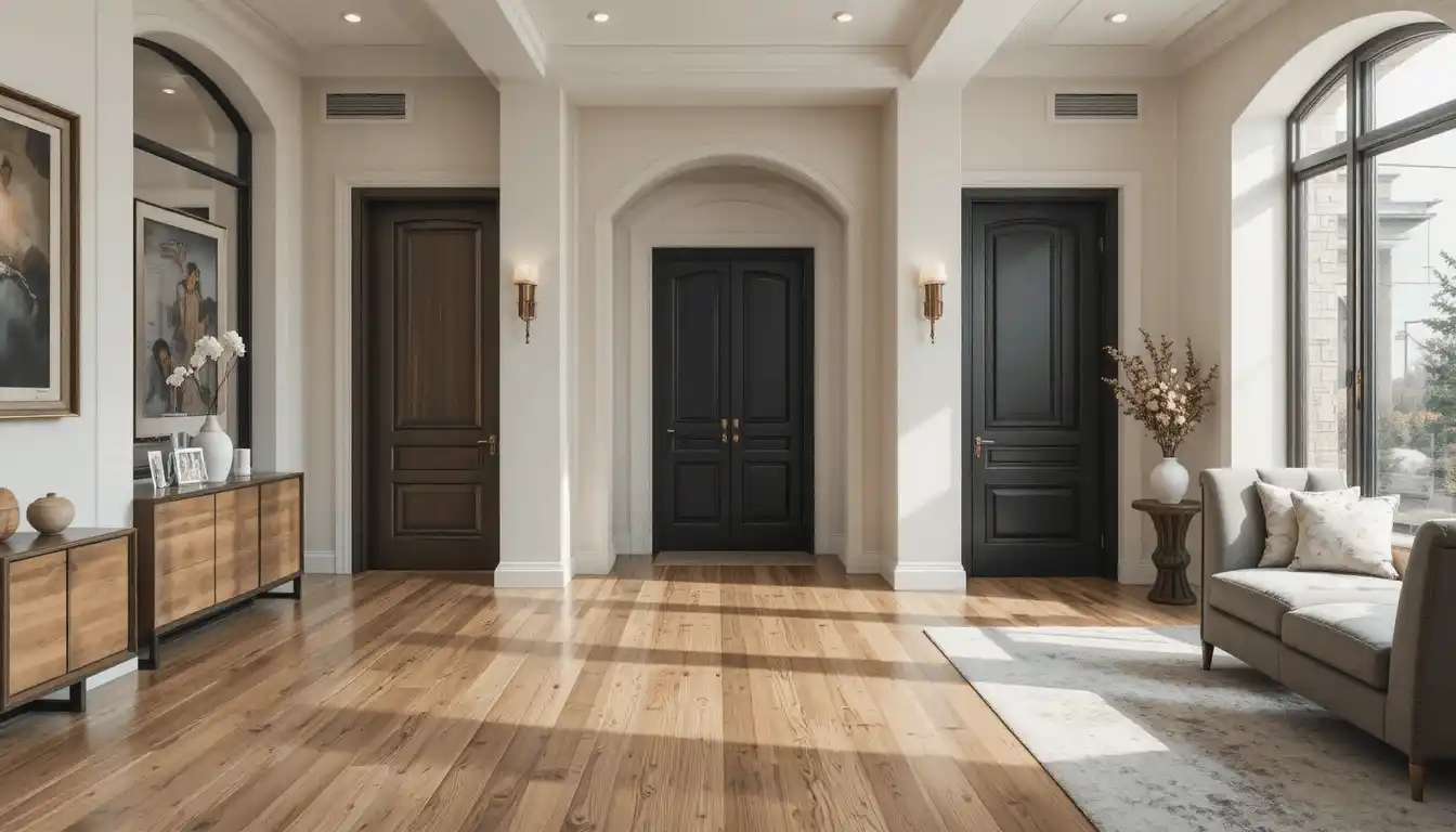
1. How to Make Hallways Look More Luxurious with Matte Black
Matte black interior doors create dramatic contrast and architectural depth, especially against soft white walls. This solves the problem of plain hallways by giving builder-grade interiors a more custom and expensive appearance without needing major renovations.

2. How to Warm Up Cold Minimal Interiors with Warm Greige
Warm greige doors soften modern interiors that feel too cold or sterile. The balance between beige and grey creates warmth while maintaining a clean aesthetic, helping homes feel more welcoming and visually refined.
3. How to Add Timeless Elegance with Soft White Doors
Soft whites with warm undertones create a cleaner and more luxurious look than stark bright whites. They reflect light beautifully while helping interiors feel airy, cohesive, and timeless rather than overly clinical or flat.

4. How to Create a Designer Look with Deep Olive Green
Olive green interior doors add richness and sophistication while still feeling natural and calming. This color solves the problem of boring neutral interiors by introducing depth without overwhelming the space visually.

5. How to Make Modern Homes Feel More Expensive with Charcoal
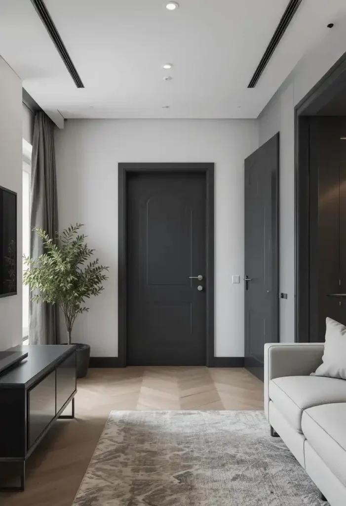
Charcoal grey doors create subtle drama without the harshness of pure black. They work especially well in modern homes where homeowners want contrast while maintaining softness and elegance throughout the interior.
6. How to Add Warmth Using Natural Wood Tones
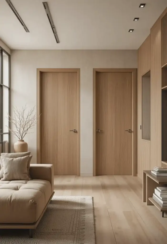
Natural oak, walnut, or ash-toned doors instantly make interiors feel richer and more authentic. Wood-inspired finishes solve the problem of flat painted surfaces while adding texture and warmth to modern spaces.

7. How to Make Small Spaces Feel Larger with Color Drenching
Painting doors the same color as walls creates a seamless visual flow that makes rooms appear larger. This “color drenching” trend eliminates harsh visual breaks and gives homes a softer luxury feel.

8. How to Add Sophistication with Deep Navy Blue
Deep navy doors create a classic luxury look without feeling too dark. They pair beautifully with brass hardware, neutral walls, and warm lighting, helping interiors feel elegant and professionally designed.

9. How to Make Beige Interiors Feel More Modern
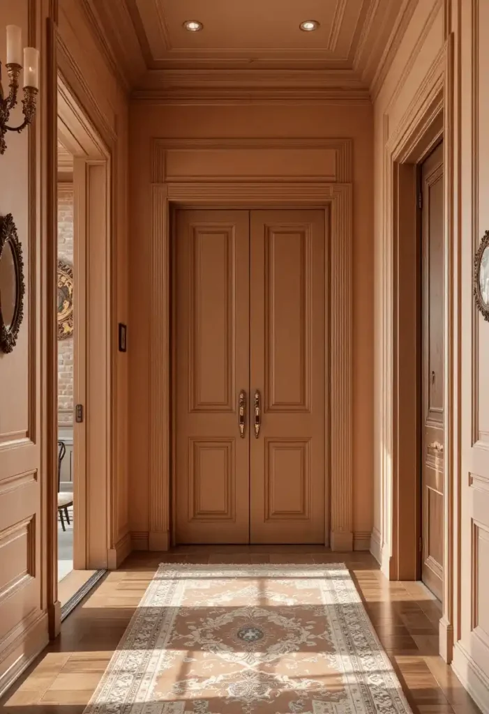
Soft mushroom and taupe door colors modernize beige interiors while keeping warmth intact. These tones solve the problem of outdated brown-heavy interiors by introducing more balanced and sophisticated earth tones.

10. How to Add Personality Without Looking Trendy
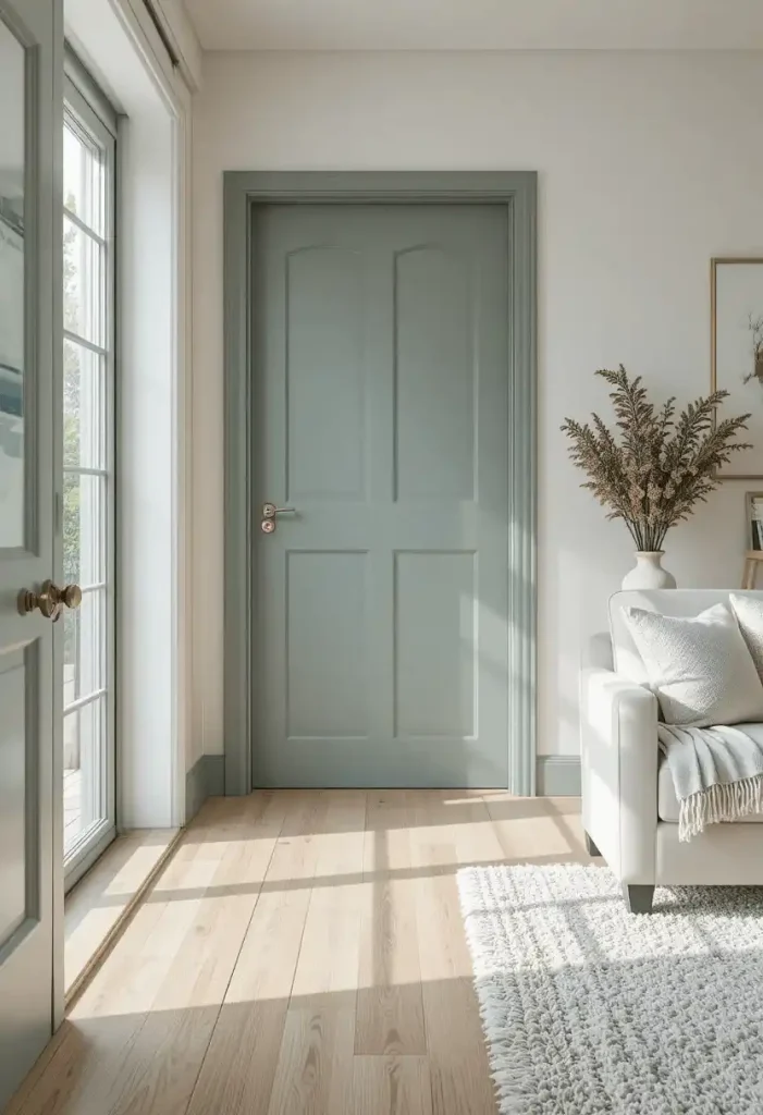
Muted sage green doors add personality while still feeling calm and timeless. Unlike brighter greens, sage works as a neutral and blends naturally with wood, stone, and warm modern interiors.
11. How to Create High-End Contrast with Black and White Interiors
Black interior doors paired with white walls create strong architectural framing that makes homes feel custom-built. This solves the problem of visually flat spaces by introducing depth and definition.

12. How to Make Traditional Homes Feel Updated
Warm clay, terracotta, or muted burgundy doors refresh traditional interiors without removing their classic charm. These earthy shades add warmth and modern character while preserving timeless design elements.
13. How to Keep Neutral Homes From Looking Boring
Soft stone grey doors add subtle contrast while maintaining a calm and luxurious atmosphere. This solves the problem of overly flat neutral interiors by adding visual layering without harsh color shifts.
14. How to Create a Cozy Luxury Feel with Warm Taupe
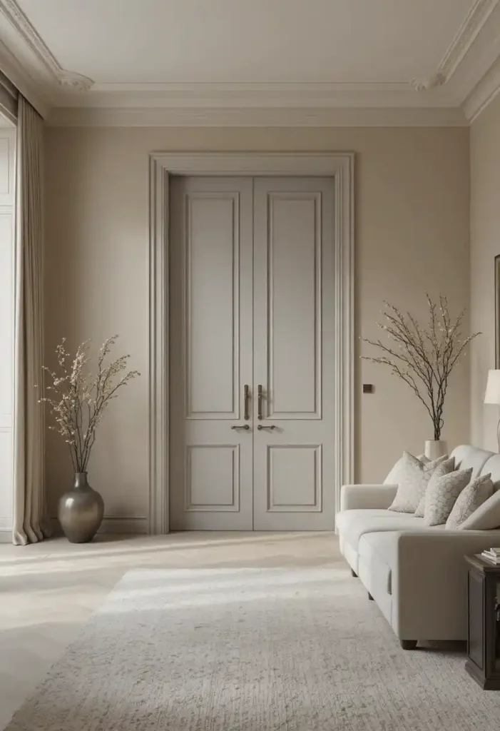
Warm taupe doors make interiors feel softer, calmer, and more expensive than cool grey tones. They work especially well with warm wood floors and textured fabrics for a cozy luxury aesthetic.

15. How to Make Interior Doors Look Custom and Expensive
Using satin or matte finishes instead of glossy paint gives doors a softer, more architectural appearance. Modern luxury interiors now favor textured matte finishes that feel refined and less builder-grade.

Conclusion
Interior door colors have become an important part of luxury home design in 2026. Rich neutrals, warm earth tones, soft blacks, and natural greens are replacing plain builder-grade whites and outdated cool greys. The right paint color can solve problems like flat interiors, lack of warmth, or boring hallways while making homes feel far more custom and expensive without major renovation costs.